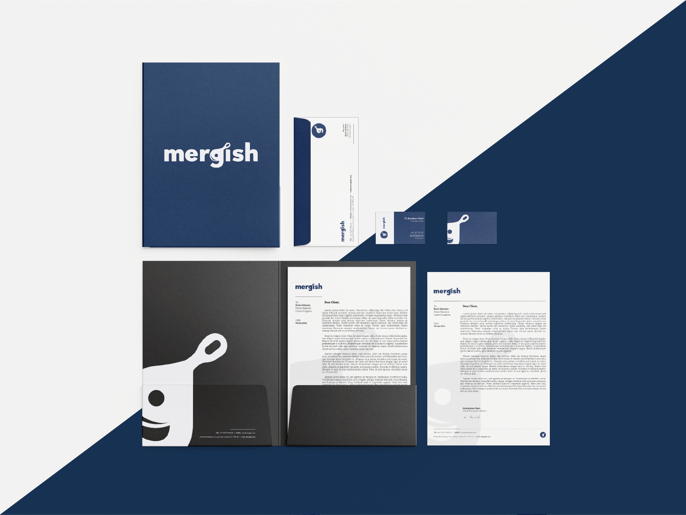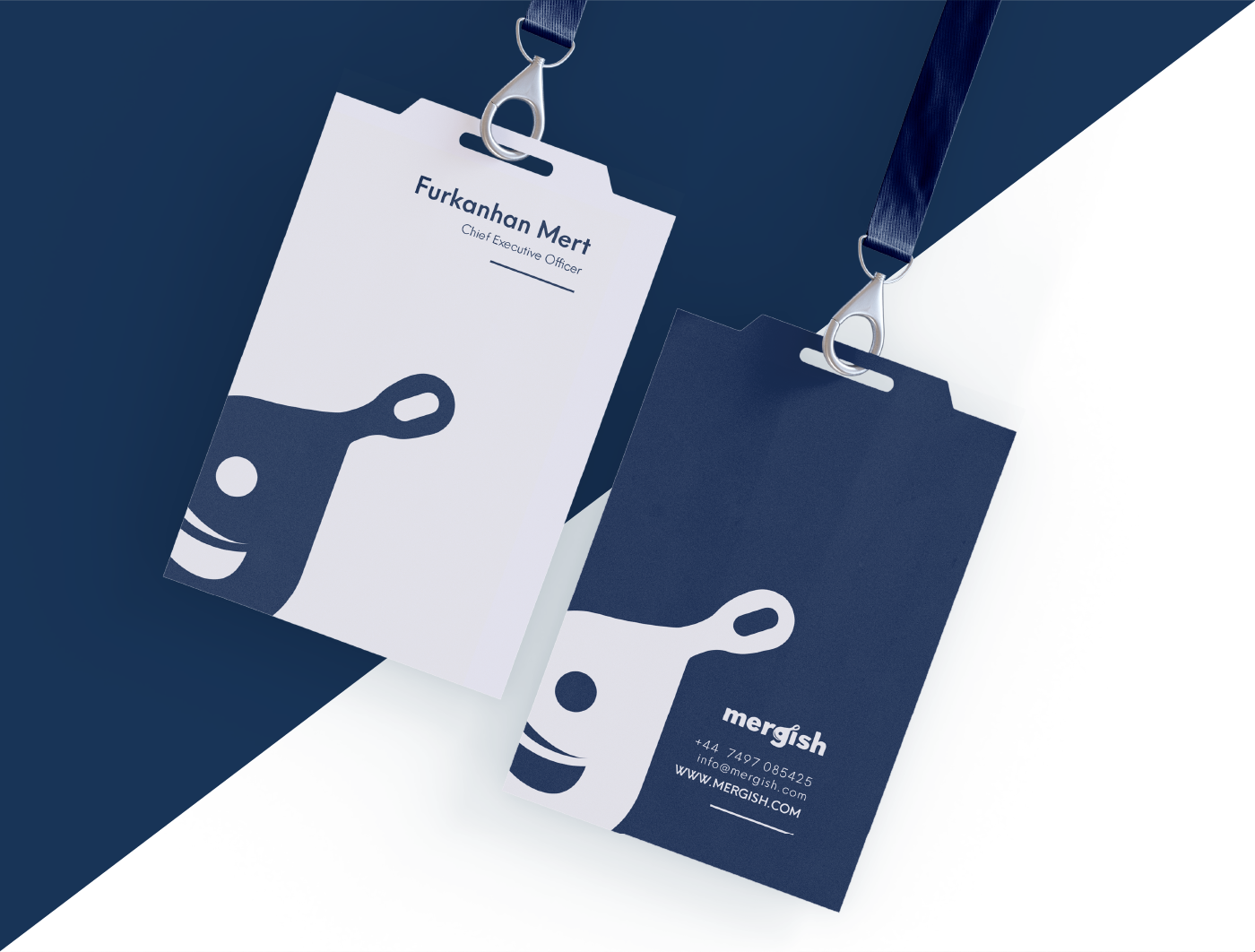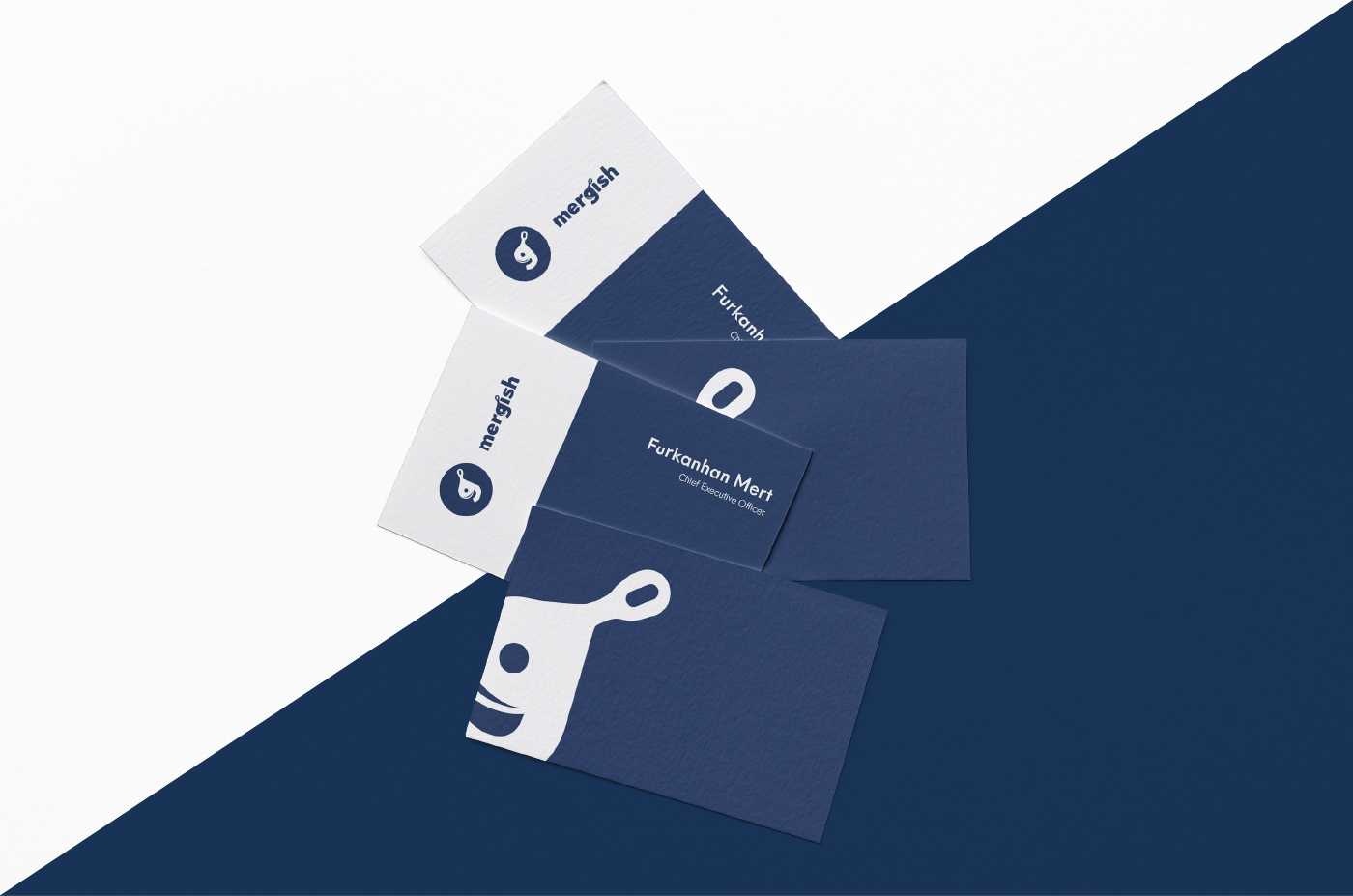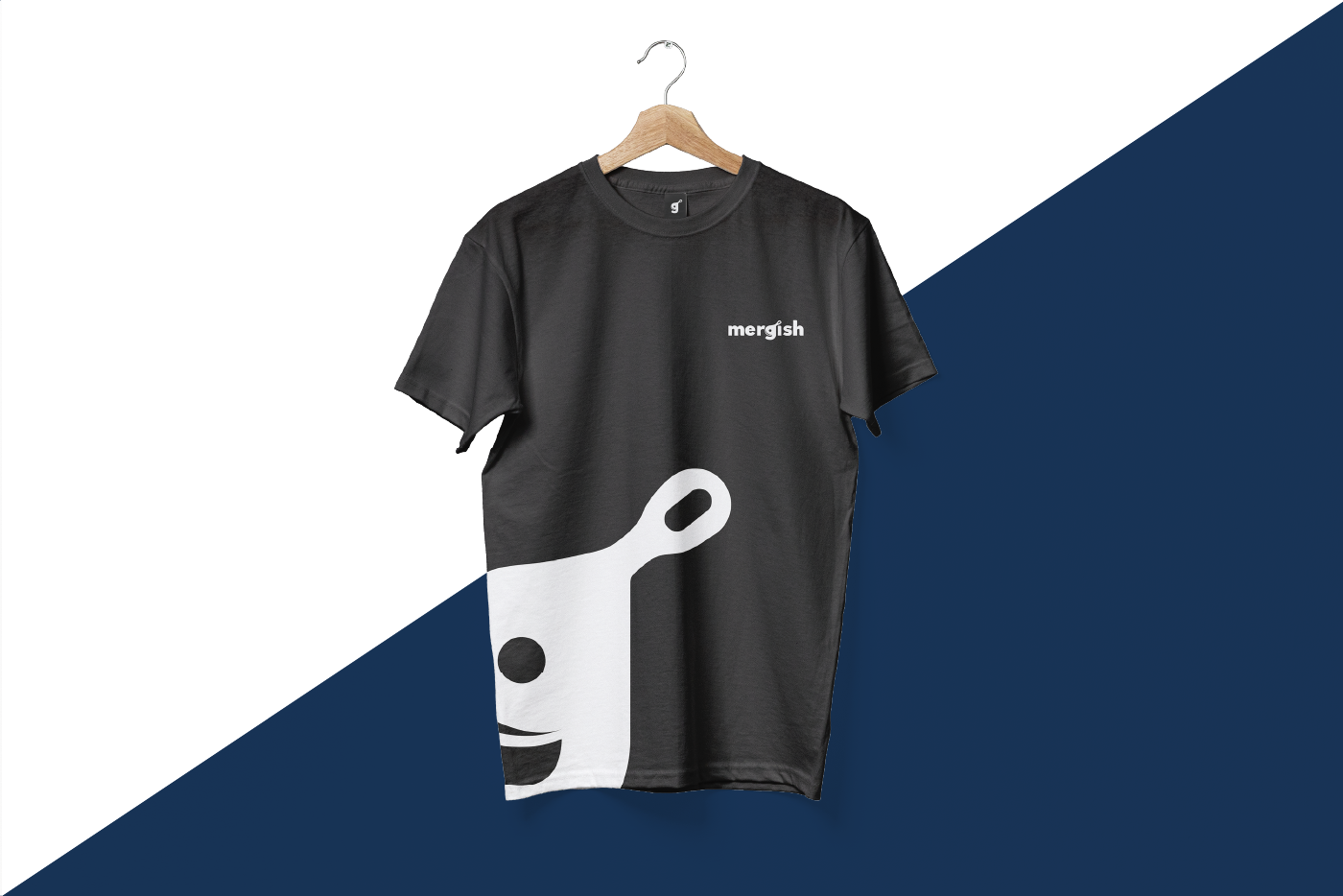
Mergish
Location
London, UK
Scope
Logo Design, Visual Identity
Date
September '21
––
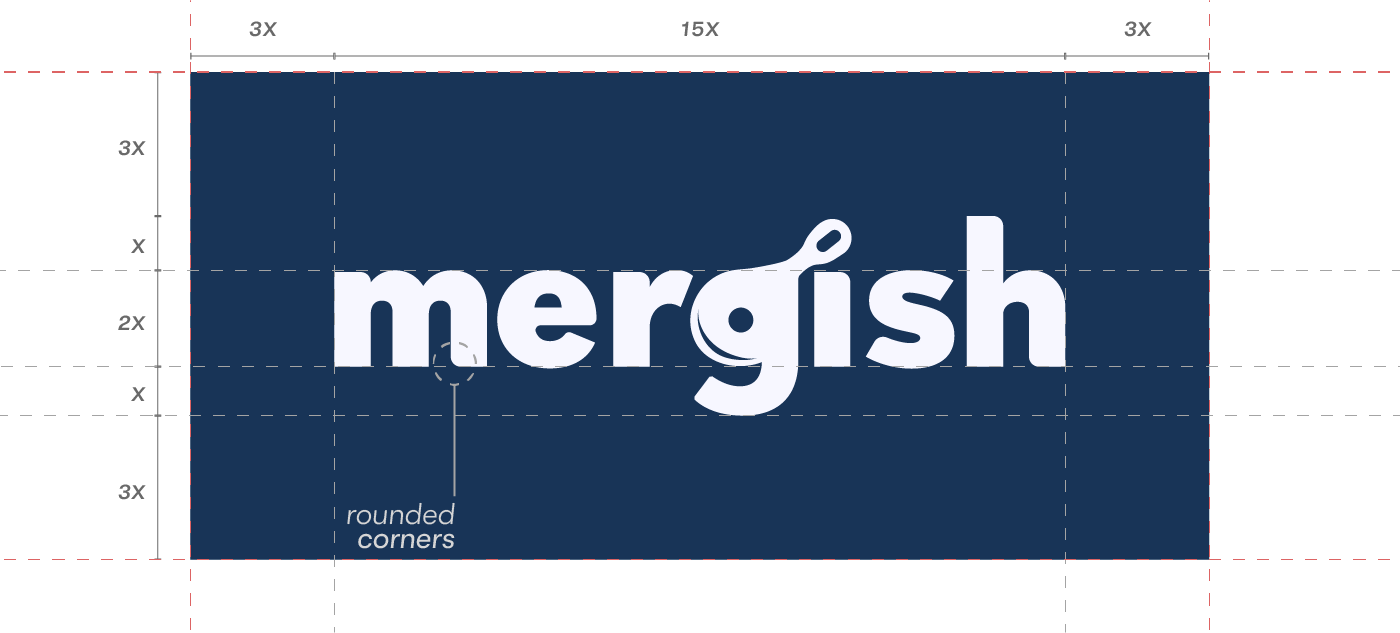
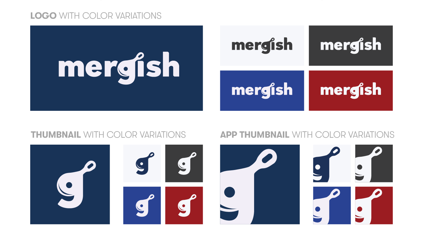
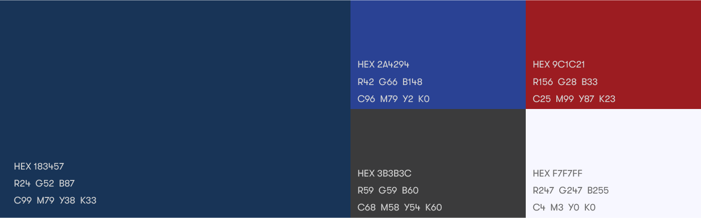
Mergish is a monitoring and management service for restaurants that helps the owners to collect data, manage their inventory, keep track of their employees, budget, calendar, orders etc. In addition to that, the field forces of Mergish are creating visuals for the restaurants and completely taking on their social media campaigns. In the logo, the pan has been "merged" with the letter "g" in order to show the resemblance of merging management with advertisement. Hues of blue has been selected as the color palette to show trust and reliability. A minimal approach with the logo and typeface helped to build a contemporary and stabile approach in brand identity.